You are using an out of date browser. It may not display this or other websites correctly.
You should upgrade or use an alternative browser.
You should upgrade or use an alternative browser.
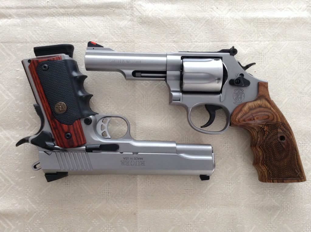
Model 69 smith and Wesson
- Thread starter FilthyHarry
- Start date
Hal said:Looks like most don't like the looks of it.
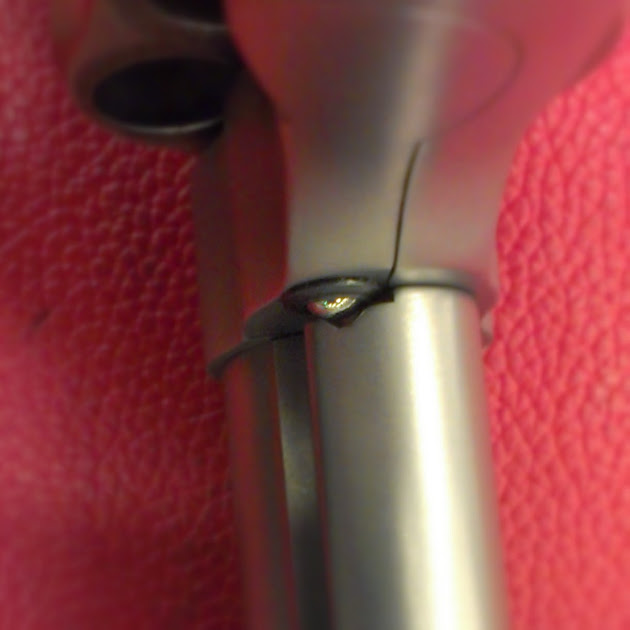
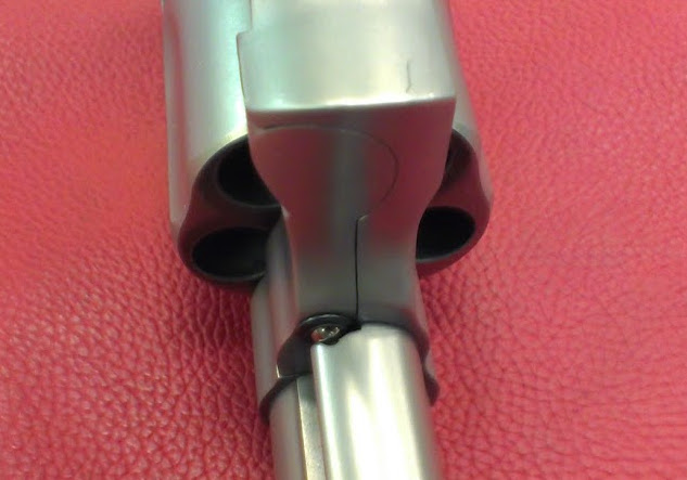
I agree, most who voiced issues seemed to have based their opinion on looks. But it's supposed to look as it does (i.e., off centered). As I mentioned in that thread, the M69 and M66 I examined both locked up surprisingly tight. The target will tell the tale, though.
Hal said:I'd still like to know if it's such a good design, does S&W use it on other models?
I recall it being on one of their M&P revolvers. Generally, though, the standard underlug engagement design works well (so long as the ejector rod doesn't bend), and is likely cheaper to produce.
I don't know for sure, but my guess is it's use on these new offerings may have to do with the design of that 2-piece barrel: Could be, the underlug, which isn't part of the barrel, simply isn't stiff enough to engage the front of the ejector rod effectively and/or isn't thick enough to hold the plunger.
That and time.The target will tell the tale, though.
Time will tell if it's all BS or not.
I'm in no real hurry though.
I have a feeling that more than a few of these, w/very low round counts, will find their way to the used market.
That and time.
Time will tell if it's all BS or not.
I'm in no real hurry though.
I have a feeling that more than a few of these, w/very low round counts, will find their way to the used market.
Hal is offline Report Post
I just wish they would find their way to California's handgun list so I can buy one
Gary
Technosavant
New member
That sure has the ring of "my back is wet, are you telling me it's raining" to it doesn't it?
Nope.
Think about it. If it were perfectly centered, the ball detent would be applying force either to both sides of the V equally or none at all. In that case it wouldn't be all that useful... it could eventually introduce some play to the equation (if it were not touching at all) or certainly wouldn't keep it any tighter (if it were touching both sides).
By bearing only on the side of the V toward the "open" side it provides a slight amount of thrust in that direction, keeping things locked up and helping keep the thing tight.
It may not look right but it doesn't take an engineer to realize that's a better way than making it cosmetically perfect but functionally worthless.
I'm not convinced.
Every picture of a ball detent or schematic I can find shows the ball centered. not hitting just one side.
As I said above, time will tell.
If the design holds up, then it's a non issue.
(I've put in my share of "unpaid beta testing" for new products in my lifetime so in this case, I'll take a pass and let someone else spend their money first.)
Schematic and explanation -- FWIW
http://smith-wessonforum.com/s-w-re...590-fyi-model-69-66-8-ball-detent-design.html
I have right at 1,550 rnds thu 2 M69s (820 & 730 respectively). About 75 percent have been 240 - 260 gr SWCs with 6.5gr HP38 for a chronoed 880 fps. Haven't had any problems except they shoot high with Magnum ammo.
I don't find .44 Magnum ammo to be abusive -- wouldn't shoot a bunch at one time, but certainly not painful. Mine are equipped with the Hogue 500 X Frame grips -- I have a problem with the bone at the base of my thumb.
I really like this gun, it just works for me.
Paul
Last edited:
S&W is correct about how that ball detent is working.
It has to apply pressure to the side of the groove so that the cylinder will stay in tension. If tension wasn't necessary, and all that was desired was for the cylinder to not fall open, then centered in the groove would be fine... and there would be a minute amount of "wobble" in the cylinder.
If you want the cylinder preloaded shut, the ball detent should be against the side of the groove. Doesn't matter if it "looks" odd, it's doing the job it was designed to do.
My buddy snagged one of these a couple months ago. The ball sitting NOT in that little dish was one of the first things that caught my eye. For those of us who aren't engineers and gun makers, it absolutely looks wrong. But if they're all made that way and Smith & Wesson has signed off on it, I'm fine with it.
I don't think it's rational for even the folks who REALLY like the design to tell us unwashed masses that it doesn't look "wrong" just because we need it explained to us. For sure... to a normal person... it looks wrong.
I might make the argument that if is designed exactly how they wanted it, could they not have dished it out a bit less? That extra divot of steel *GONE* where the ball never gets far enough to lay in... WHY?! The ball isn't ever going to get that far, all that missing steel does is attract the human eye, begging the question, "why didn't the ball get in to this spot that seems to be created specifically to cradle that ball?!"
I can understand that explanation and rationale of the design and I'm fine with it. But I do -NOT- see why that divot has to be exaggerated, as it draws human eyes directly to it. Heck, if the steel were a mirror finish, you could see the question mark in the camera's eye in these pictures.
For those of you worried about how much of the ball is in the detent, have you checked to see if your barrel shroud is canted? Mine was canted, so the front sight leaned to the left, the grooves on the top of the shroud did not line up witht the grooves on the top strap, and the ball was barely in the detent. It was pretty minor, but it needed to be fixed. Because of the two-piece barrel design, I figure S&W can fix it in about five minutes.
Other than that minor issue, I really really like it. Accuracy has been excellent, and for whatever reason (probably grip design) the felt recoil is less for me than with a 6" model 29. I think S&W has a real winner with the M69.
Other than that minor issue, I really really like it. Accuracy has been excellent, and for whatever reason (probably grip design) the felt recoil is less for me than with a 6" model 29. I think S&W has a real winner with the M69.


