It's not a "rank" -- it's a statistical outcome from real-world shootings. Weird things happen, and the world is not obliged to make sense to us.
It is a rank, a horizontal row of items is a rank. Other than putting .25 before .22 it is also in ascending order, by size of round.
It is a statistical outcome of the data
they chose to use.
I looked at the article, found the full data used as given to be somewhat interesting, and shows that the table posted here is valueless without explanation or background. I do not agree with the authors chosen parameters, and the way information is presented without explanation.
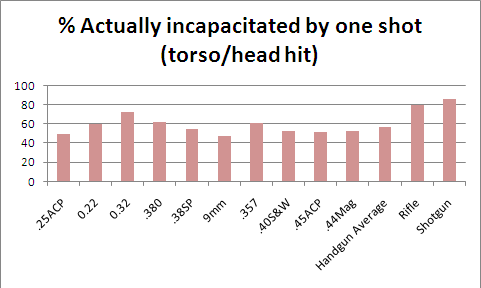
For example, he gives a percentage of one shot stop and a percentage of actual incapacitation from one torso or head hit. For the .32acp the one shot stop % is 40 but the "actual incapacitation" % is 72!!
I'm sure his math is sound, but as presented, no sound conclusions can be drawn without assuming things "not in evidence".
I don't know, because the author does not say, it doesn't seem to make sense, that the percent actually incapacitated is higher than the percent stopped.
UNLESS you realize that the percentages are of different things. WHAT things the percentages are of, is not clearly stated. Some appears self evident, some, not so much.
Say 40% are one shot stops. But 72% are "actually incapacitated". How can that be?? It COULD BE that 40% of the people shot were stopped, and 72% OF THE PEOPLE STOPPED were "actually incapacitated".
It could be something else, the author does not say. SO the table posted here is useless for drawing any valid conclusions other than its what the author's math came up with, the way he worked it.
Percentages and averages can be useful, can be statements of fact, but are not always valid indicators of anything other than the math used to create them.
Which is what I believe this table to be.