Y'know, the buying and gun-owning public, from the brand new shooters to the video game folks who just want to snag whatever item they've come to love on their TV screen to the life long hobbyists and purists, competition shooters, collectors, and FILL IN THE BLANK make up a group that all look for different things in their handguns.
Some love the modern guns that use lighter weight, high strength materials and modern manufacturing to make a durable and fine running platform, like something modern and polymer. Others refuse the newer stuff and only get excited with steel topped off with a bit of wood. We can argue til the cows come home about big things and little things and even if we manage to agree on a single platform (say a group who all happen to love a 1911) then we can divide ourselves further when it comes to sights, triggers, serrations, grips, finish, MSH, etc etc etc.
Yes, there's not a thing wrong with this. Variety is the spice of life and if we all had the same thing it would be boring.
What I am chasing here is the idea that there must be something that like 97% of us can agree on, and I'm only bringing it up because it baffles me that if we all agree, why do some of the gunmakers keep doing it?!
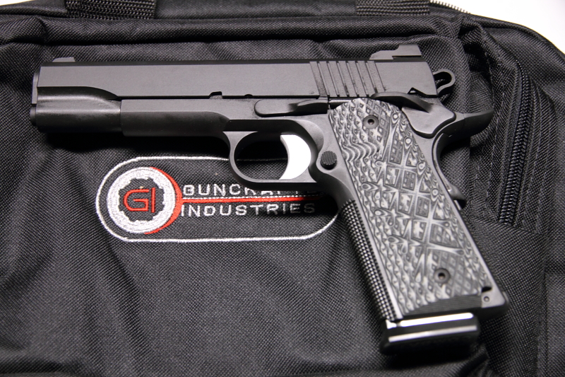
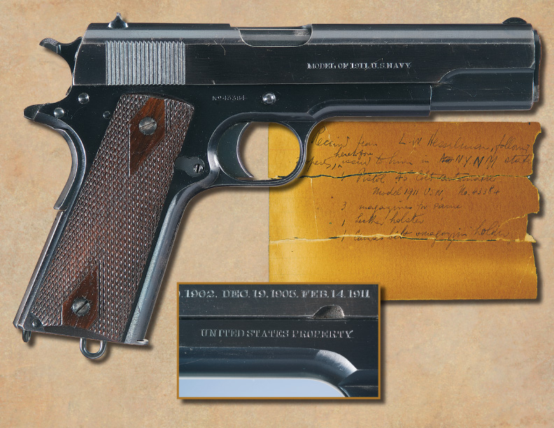
I submit: billboard type writing/script on your handgun!
Don't we almost all agree that it just looks horrendous and when all else is equal, it looks awful and the other direction is infinitely better?
Look at a Dan Wesson 1911 and tell me what you see, visually.
Now, look at the Desert Eagle 1911 and just tell me what pops in to your head.
Many believe STI makes a decent handgun and their logo/rollmark with the -sTi- inside the outline of the State of Texas is a fine looking trademark, but WHAT are they thinking when they pound out that h-u-g-e trainwreck model name down the side of the slide?
Rock Island has recent taken to making a neat little logo of their brand at the rear of the slide with their new guns, getting away from the horrendous full-length stamping down the side of the slide. The older ones look like a 53-foot trailer behind a big rig!
The Taurus 1911, for whatever you think of it, would look better without 10 minutes worth of reading down the slab sides, wouldn't you agree?
Which Wilson pistols look better? The ones with barely anything on them, or with HUGE, all-caps names etched in to the length of them?
Does anyone disagree with what I'm trying to say here (with far too many examples?!
 )
)
Some love the modern guns that use lighter weight, high strength materials and modern manufacturing to make a durable and fine running platform, like something modern and polymer. Others refuse the newer stuff and only get excited with steel topped off with a bit of wood. We can argue til the cows come home about big things and little things and even if we manage to agree on a single platform (say a group who all happen to love a 1911) then we can divide ourselves further when it comes to sights, triggers, serrations, grips, finish, MSH, etc etc etc.
Yes, there's not a thing wrong with this. Variety is the spice of life and if we all had the same thing it would be boring.
What I am chasing here is the idea that there must be something that like 97% of us can agree on, and I'm only bringing it up because it baffles me that if we all agree, why do some of the gunmakers keep doing it?!
I submit: billboard type writing/script on your handgun!
Don't we almost all agree that it just looks horrendous and when all else is equal, it looks awful and the other direction is infinitely better?
Look at a Dan Wesson 1911 and tell me what you see, visually.
Now, look at the Desert Eagle 1911 and just tell me what pops in to your head.
Many believe STI makes a decent handgun and their logo/rollmark with the -sTi- inside the outline of the State of Texas is a fine looking trademark, but WHAT are they thinking when they pound out that h-u-g-e trainwreck model name down the side of the slide?
Rock Island has recent taken to making a neat little logo of their brand at the rear of the slide with their new guns, getting away from the horrendous full-length stamping down the side of the slide. The older ones look like a 53-foot trailer behind a big rig!
The Taurus 1911, for whatever you think of it, would look better without 10 minutes worth of reading down the slab sides, wouldn't you agree?
Which Wilson pistols look better? The ones with barely anything on them, or with HUGE, all-caps names etched in to the length of them?
Does anyone disagree with what I'm trying to say here (with far too many examples?!


